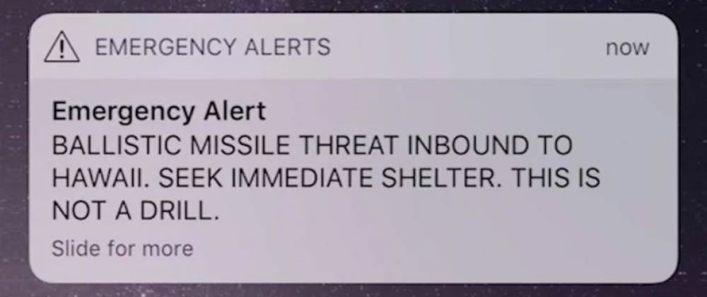
An emergency notification on Saturday informing Hawaiians that a missile was inbound and moments from impact in their vicinity left residents, visitors, and vacationers of the state pretty flipping shaken up. For fun, it took about a half hour to let everyone in on the joke, it was a false alarm.
Let that wobble around for a sec – you’re on vacation with your kids and just gearing up for some beach time and all the phones around you scream to life, shouting holy f#ck, there’s a missile INBOUND right this minute. Oh umm seek shelter. WTF “seek shelter” means in the face of an immediate inbound missile attack is a different topic. But suffice it to say your vacation is gloriously unhinged. So you proceed to flip the hell out for the next 30 or so minutes until your phone says, JK JK, you’ve been punked. What the hell just happened?
So… the questions are:
- How did this happen and…
- How did it take so damned long to unf#ck.
The answer to both is, as a software developer, astonishing… and as someone with experience in government software (ahem healthcare.gov, looking at you), not the least bit surprising.
So it was human error that caused the alert to be sent out. Sort of. A human clicked the wrong button, yes, but WOW the interface that allowed that to happen is so far beyond amateur hour it’s not even funny.
Let’s have a look.
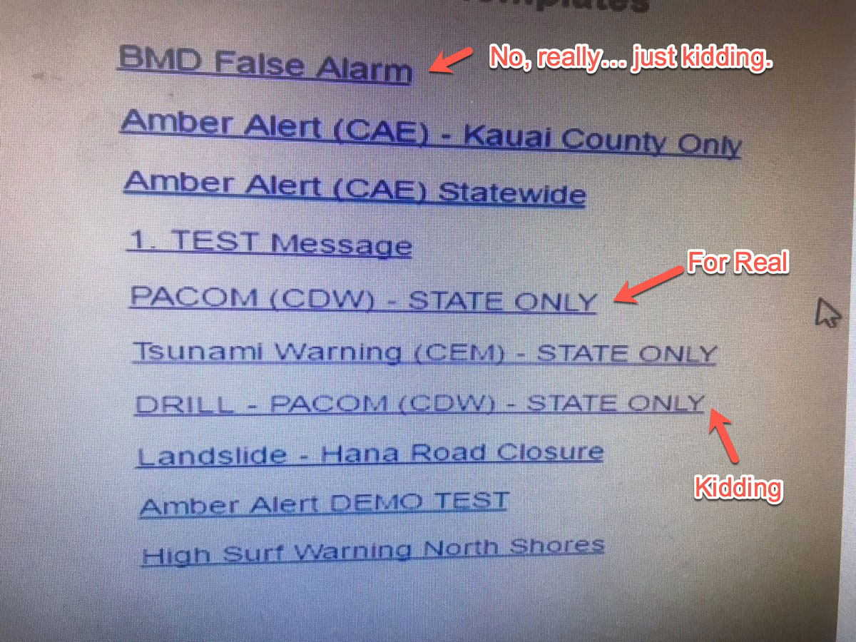
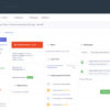
Ok so here we see the interface in all it’s glory. Clicking one of those clearly and well designed links kicks off an emergency broadcast, presumably with no confirmation such as “Do you REALLY want to flip the entire state out right now?” The administrator clicked the “PACOM (CDW) – STATE ONLY” link instead of clicking the “DRILL – PACOM (CDW) – STATE ONLY” link. A simple mistake in the early morning that anyone could have made. And the best part was that even though he immediately realized what he’d done, there was NO way to undo or send a revised alert.
The problem here starts with UX and interface design.
- There is no visual distinction between drills, tests and the real deal.
- There is no failsafe or confirmation that forces a user to double check – “do you really want to send this?”. Seriously what software interface DOESN’T have a confirmation check for important actions? Confirm purchase, delete this image, cause statewide panic…
- There
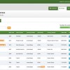
iswas no undo. There was no way to send a revised alert or cancel the existing alert. The link at the top that says “BDM False Alarm” is new :). Brilliant.
This interface is pretty much unforgivable in the face of the magnitude of the system and that we’re in 2018 not 1992. Developers cannot create interfaces that allow this sort of simple mistake to happen. This was a software developers fault, plain and simple – not a human error or a training issue or any other political spin we want to throw at it. Design better software folks.