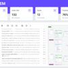
No dashboard for your business? Every day I’m amazed at how many businesses are operating with out-of-date and manually aggregated (think hours of copy & paste in Excel) data that isn’t clearly presented in an easy to view format. With the abundance of tools, free and paid out there, there’s no excuse not to have your finger on the pulse of your business or department.
I want to outline here some of the key questions to consider when building out a business dashboard.
1. Who is the dashboard for?
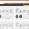
Consider the audience of the dashboard first. Is it for the executive team where granular operational metrics would be confusing and high level leading and lagging indicators would be appropriate OR is it for an operations person that needs the real-time data and is less concerned with lagging indicators? Start with thinking about the intended user and what data they would need to improve their job function, and leave all other data for a different dashboard.
2. What numbers “move the needle”?
It’s easy to fall into the trap of adding every metric you can think of to a dashboard, and end up with an overloaded mess that defeats the purpose entirely. The more information displayed at once time, the less important each one becomes. Consider what the critical, important metrics are for the function or department that the dashboard is for. If you’ve defined the KPIs properly, than having 1 or more of them fall out of line would indicate that it’s time to dig deeper. Don’t add confusion and bloat by putting everything on screen at once.
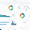
3. What is the best way to visualize the data?
You can plot the same metrics in multiple ways. You can show historical data compared to current data, show trends, show progress towards a goal, etc. Let’s say for example you have a KPI for Number of Leads that you want on a dashboard. You can display it simply alongside a goal number, display it as a progress bar, or show the previous 12 months Number of Leads to indicate growth or lack of it. Think about what you want the metric to reveal or uncover when visualized on the dashboard.
4. Does it tell a story?
Is the dashboard easy to understand quickly and what story does it tell? Numbers are only relevant and actionable in context. Is the Number of Leads on your dashboard telling the story of growth over time or would it be more appropriate to tell the story that tis month we hit our lead generation goal. Adding a trend line, for example, would tell the story of where things might be headed. Same numbers, different story and all about context.
5. Where is the data going to come from and is it automated?
This is one of the more challenging bits for most companies, where Excel is king and data is mainly stuck in static systems. After you’ve identified the dashboard KPIs and considered how to best visualize them for maximum clarity and impact, it’s time to think about how you’re going to get at that data. Does is need to be manually entered from an Excel sheet or is it in an online platform that can be tapped into easily? Even a static data source like Excel can work fine with the right processes in place to ensure it’s always up to date, but the ideal solution is one that takes no effort to aggregate. Connecting your dashboard to your CRM to pull in the number of leads, for example, will always be real-time and accurate vs a manually aggregated solution.
If you want more information on designing, developing and implementing business dashboards, contact us for a free consultation.